eSentire
I worked with eSentire over the course of 2 years. I started by redefining their brand’s visual identity to match the CMO’s and CPO’s strategic shift from product feature-based selling to customer-value-based selling. Together, with eSentire’s small in-house creative team, we modernized the brand while respecting the company’s history. I directed the team on logo redesign, color palette revisions, and brand guidelines. I also created the presentations to secure executive sign-off on the proposed new direction within 2 months of the project start.
Next, we redesigned and rebuilt the entire website from the ground up, including migrating the backend and setting up a new, user-friendly CMS. In partnership with a team of 4 others (in-house and external), we delivered this within 3 months, enabling eSentire to unveil its rebrand at the most important conference of the year - RSA 2019. For the initial website overhaul, we elevated the brand impression, reducing the number of (unnecessary) pages, streamlined the website copy, and improved UI/UX, resulting in increased organic traffic.
For the next year and a half, I continued to partner on website improvements to enhance SEO and increase lead generation while maintaining brand standards. Finally, I am very proud to say that I was able to mentor the in-house designer and cultivate his talent to the point where he was promoted to Creative Director at eSentire.
Roles:
Creative director
Designer
Mentor
Front end developer-embedded designer
Project dates:
2018 - 2020
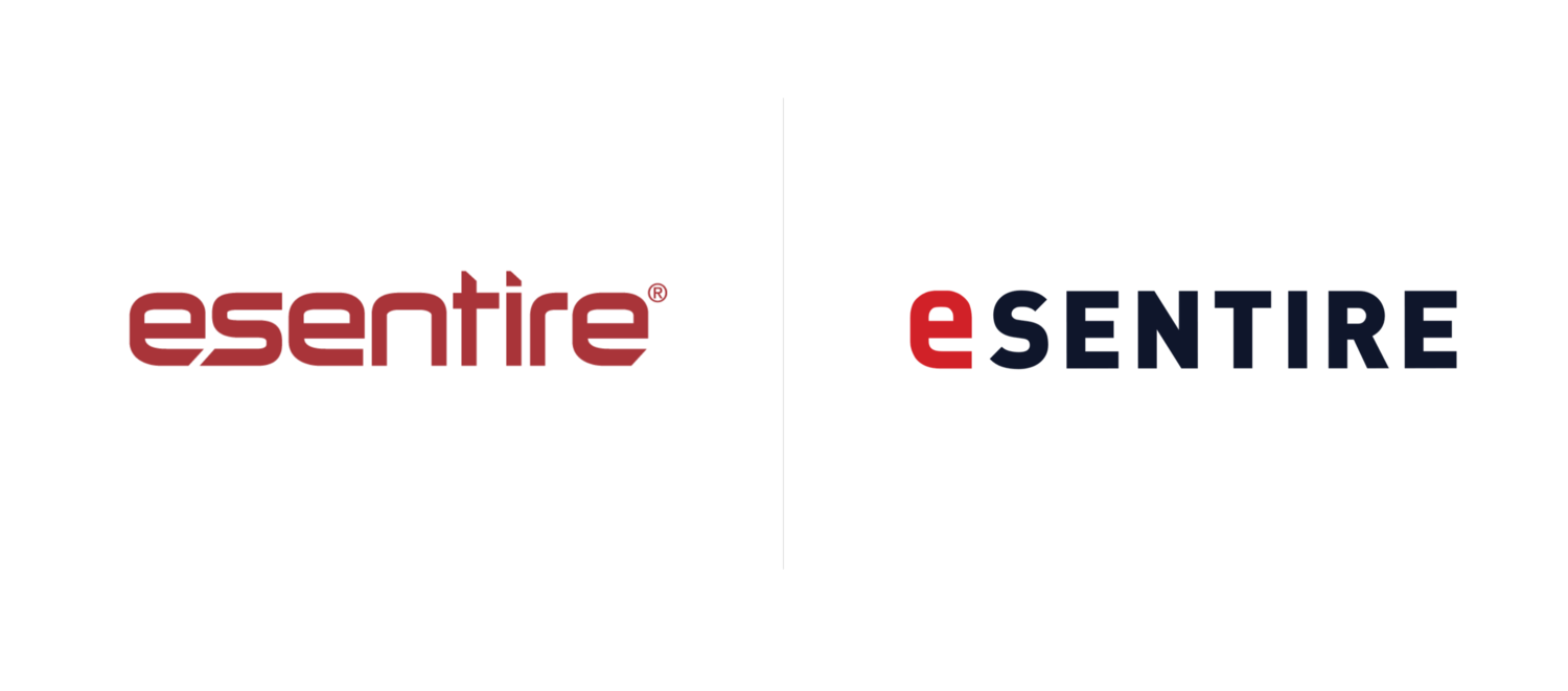
Legacy Logo and eSentire’s refreshed logo
eSentire’s New Brand
eSentire’s original colors were primarily black and red. Black is a very hard, strong color, and the red it was paired with comes off as harsh and alarming. At the time, this was a color palette used by many of eSentire’s competitors, making it difficult for eSentire to stand out. Other same competitors instead chose comical, cheesy creative. Neither of these branding directions acknowledges that cybersecurity is a serious issue without relying on fear tactics. With the product and marketing teams, we identified that eSentire brand promise would focus on empowering clients to feel safe and secure. Our color choices then were clear: we needed colors that convey trust and security, while honoring eSentire’s history (nearly 20 years).
We selected a dark navy blue as it is a strong color, like black, but as not harsh, that has an in-buit societal association.
We paired it with a new, brighter red that is more vigilant than the original, while remaining distinct from other competitors. Coupled with navy, it transforms from alarming to dependable. The brand now communicates that eSentire is trustworthy of protecting you from hackers and unknown threats without FUD (industry lingo for relying on Fear, Uncertainty, and Doubt to scare you into a decision).
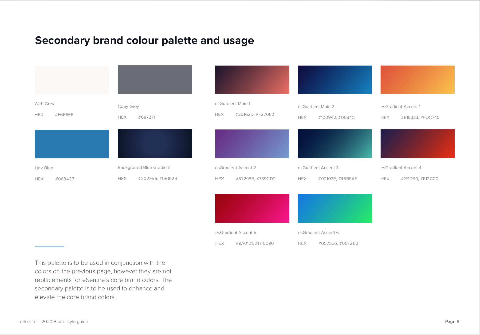
Yet, these two colors alone can make for an overwhelming dark and somber palette. We introduced white and grey as refreshing and gentle balances to the navy.
The secondary palette was brought in to add dimension and levity. The use of gradients here is very purposeful and calculated. Too much and you tip away from professional into silly and sophomoric. Too little and it’s just confusing - the opposite of secure.

eSentire’s New Website/UI design
To ensure the longevity of the site, we created a robust template of our own design whose structure could evolve past version 1.0. Based on the prior site’s issues, we knew it was very important that there be a clear user journey, so the marketing team could rotate in fresh content without the design falling apart. We knew that each page needed to be a sensible destination, feel fresh, and be easy to read, with strong call outs and opportunities for internal linking.


Versive
As this startup searched for product-market fit, I was hired to refresh their brand identity to better align with their new messaging strategy. I partnered with their in-house brand and product marketing team and Chief Product Officer to help them realize and reach their goals. We dropped an incongruent logomark that misdirected clients to think of a biomedical or DNA company. We softened the neon green, bright light blue, and orange color palette in the initial website rebuild (to bridge the change without being too abrupt). I then partnered with an external developer to review front-end code and ensure the execution of site met design and brand standards.
When I was approached to concept the first-ever ad campaign, we evolved the brand further - into a more serious white with select black text scheme, emphasizing a strong, firm wordmark. I extended this campaign across ads, landing pages, and video. This enabled us to more equally appeal to the business-focused CISO who was making purchasing decisions, as well as the skeptical (and very different) cybersecurity analyst who was the actual end user.
Roles:
Creative director
Designer
Front end developer-embedded designer
Project dates:
2018


Artisan
Upon arrival in Chicago, I started working through Artisan as one of their talent. In short order, they asked me to start working directly with their brand to help refine and align their visual look and feel. Waaark created the website and a brief, 3-page PDF outlining colors, some illustrations, and fonts. It was my job to transform this document into comprehensive, functional, and clear brand guidelines -- in partnership with a copywriter. As the creative lead, I protected the brand look and feel by having final approval over all designs that were both public and internally facing.
Roles/Services:
Creative director
Designer
Motion graphic designer
Vector illustrator
Project dates:
2016 - 2018


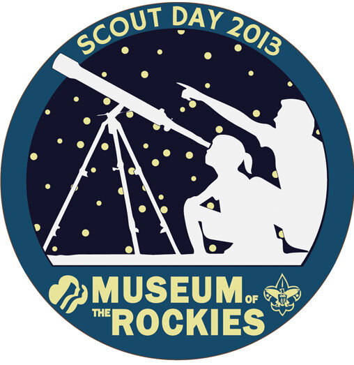
Museum of the Rockies
When I began working at the Museum of the Rockies (MOR), their brand and messaging was disjointed and inconsistent. I tasked myself with creating a cohesive brand and introduced tools and guidelines to ensure brand integrity and consistency across campaigns. In partnership with Marketing, I developed concepts for award-winning designs and collaborated with team members to deliver on time and within budget.
When the Museum was struggling to raise money for the Taylor Planetarium, I replaced their PowerPoint presentation with a comprehensive fundraising campaign which enabled MOR to reach it’s $1.6 MM goal within 6 months.
Along with the Taylor Planetarium, I had the opportunities to design both international and domestic exhibits.
I prioritized forging a relationship between design and MOR’s website developer to improve the aesthetic and usability of the website. I expanded the design department’s focus to include UI.
Having been on the receiving end of amazing mentors, I wanted to return the favor by creating the first-ever intern program at the Museum, in partnership with Montana State University’s design department. I ran the program for two semesters and hired one student each semester. I was very proud when my first intern took over as lead designer when I decided to leave the Museum in 2013.
Roles:
Creative director
Designer
Illustrator
Mentor
Employment dates:
2011 - 2013